
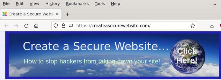
A template controls the appearance and structure of your website. The default Joomla 4 template, called Cassiopeia, has numerous limitations. First, it is difficult to create additional module positions. Second, it is not able to create a mega menu. Therefore, in this article, we will add a replacement template, called Helix Ultimate, that provides easy ways to create a mega menu and additional module positions.
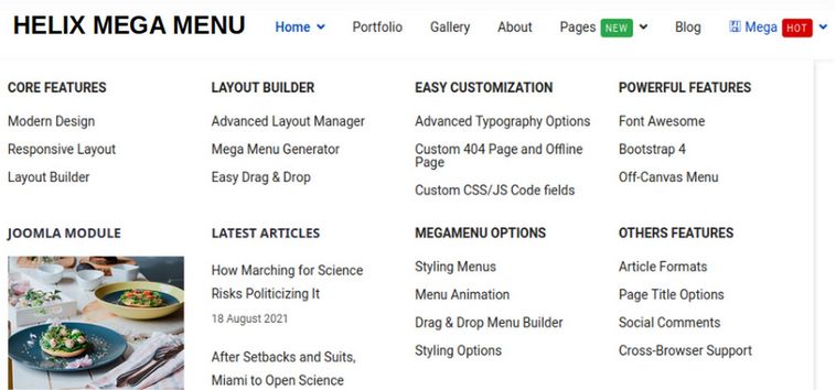
The Helix Ultimate template is a free, open source template that allows you to easily customize the appearance of every aspect of your website. Helix Ultimate is the only free Joomla template which allows you to easily create your own custom module positions which are responsive rows and columns where you can put boxes of content called modules or feature boxes.
The Helix template also comes with a customizable Mega Menu allowing you to create an expandable main menu which allows website visitors to visually understand how your website is structured and quickly navigate to the area they are most interested in.
Helix Ultimate is completely free to download and use. You can sell your own template based on the Helix Ultimate framework. No license fee or credit is required.
Step 1 Download the Helix Template and Plugin
To download the Helix Ultimate Template, go to the following page:
https://www.joomshaper.com/helix
Click Download Free. Then click Download.
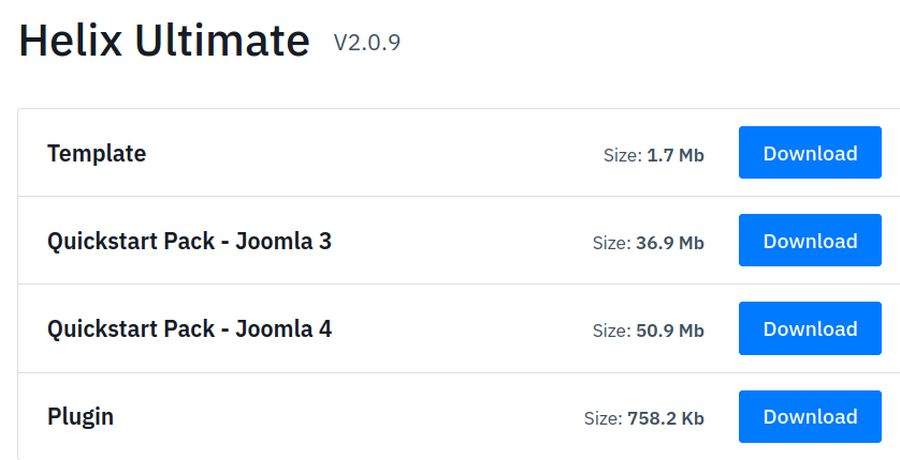
Download the top option which is the template and the bottom option which is the plugin. The Quickstart Package suffers from numerous problems. So we will just install the Helix template and plugin.
Step 2 Install the Helix Template and Plugin
Log into your Joomla Dashboard. Then go to System, Install, Extensions to install the Helix template and plugin.
Step 3 Configure the Helix Ultimate Template Basic Settings
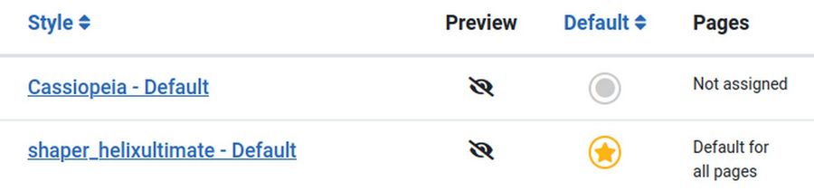
Then go to Dashboard, Templates, Styles and check the Helix template. Then click Default.
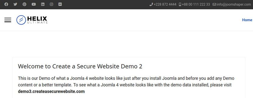
Then view the front end of the website.
To edit the Helix Template, click on it to open it. Then click on Template Options. This will open the Helix Ultimate default settings sidebar along with your website homepage. To the left side of the screen, you get the Helix Ultimate default settings options categorized in group called Basic, Presets, Layout, Menu, Typography, Blog, Custom Code, and Advanced.
Note that you can press the six dots in the upper left corner to move the menu to a different part of the browser screen if you want.
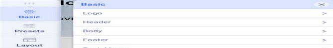
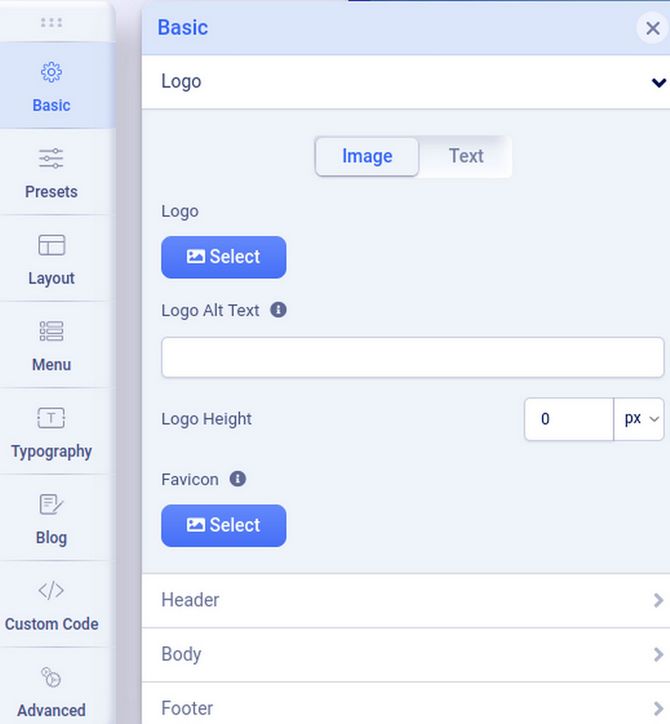
The Basic Tab is divided into categories called Logo, Header, Body, Footer, Social Icons, Contact Info, Coming Soon and Error Page. Click on the Logo option. In order to hide the Helix logo and use only our header image, change the logo height to 0 for full screen, tablet and mobile views. Then click on the Header options.
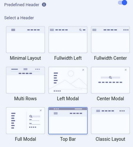
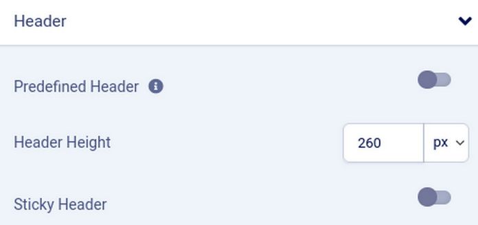
By default, the header is set for Top Bar. Turn off the Predefined Header and change the Header Height to 260px for full screen, 120px for tablet and 40px for mobile view. .
Then click Body and turn on Boxed Layout. Then click on the Footer. Turn off Copyright and Go to Top. Then click Social Icons and turn them off too. Also turn off Contact Info and Coming Soon. This completes the Basic tab options.
Step 4 Choose and Configure a Preset Color Theme
Next click Presets and choose a color theme. For example, click Preset 1. Then click the Edit pencil.
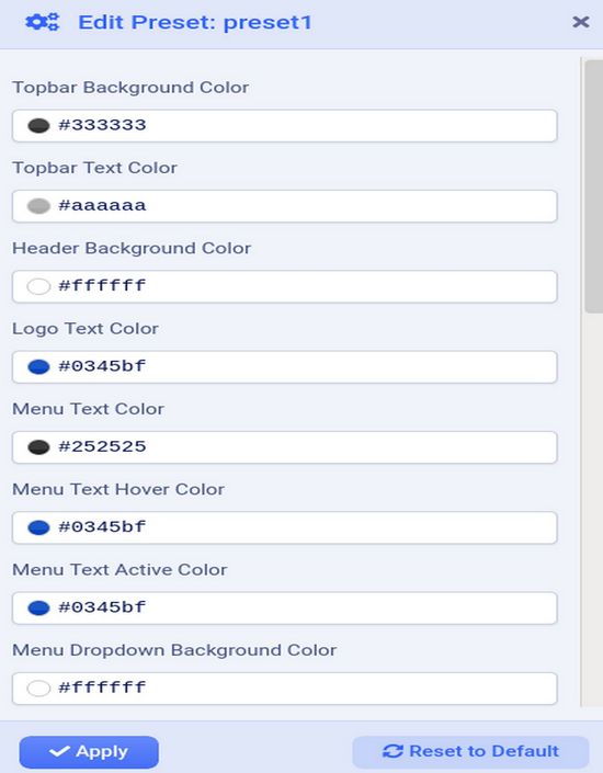
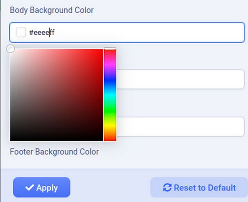
Change any values you want. We will change the body background color from white to light blue #eeeeff..
Then click Apply. Then click Layout.
Step 5 Use Helix Layout Builder to Add Module Positions
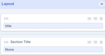
The Helix Layout Builder is one of the most important features of the Helix template. It allows us to precisely control our website layout. Click on the Layout Tab to see this popup:

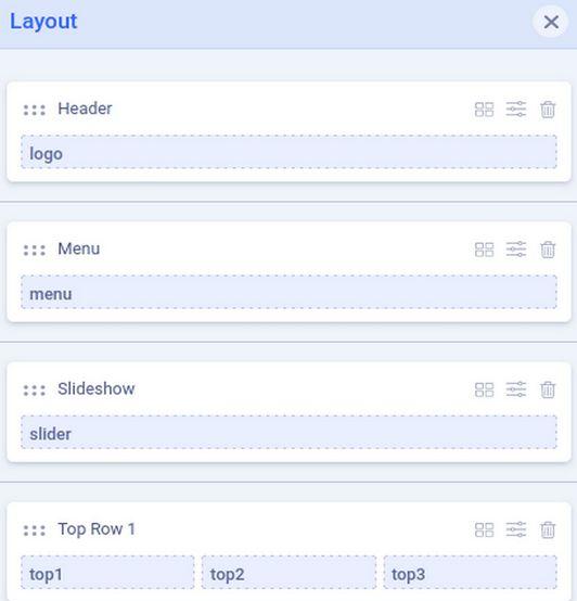
The default Helix layout consists of a Main Body with the main Joomla Content in the Component position in the middle of the page. There are also module positions to left and right of the main Joomla content component.
Note! The Helix template has two additional module positions (Content Top & Content Bottom), although they are not visible in Layout Builder, they can be used to display any modules above and below the Joomla component area.
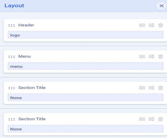
Helix has added a single row called title above the main content and also two rows, called Bottom and Footer, below the main content area. The first bottom row has 4 columns and the second bottom row has two columns. To make room for our custom header and mega menu, we will add three more rows for a total of four rows above the main content. We will use the first new row for our header, the second new row for our main menu, the third new row for a slideshow and the fourth new row for three feature boxes. To add a new row, hover your cursor over the layout. This will reveal a plus sign. Click on the Plus sign above the Main Body to add a new row.
Then click on the plus sign two more times to add two more rows.
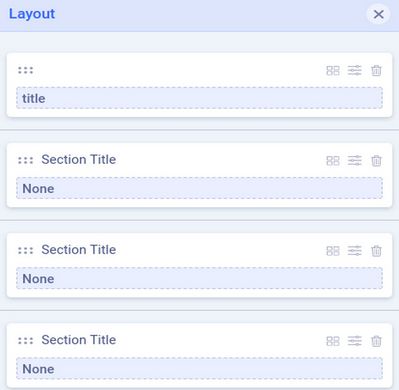
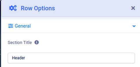
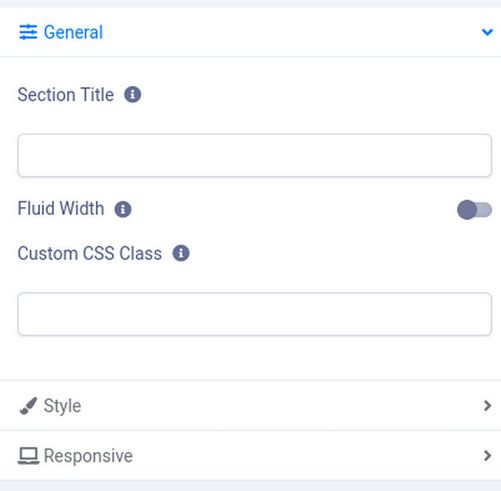
Each row has a Section title and a row name called None.
Rename the Four Rows
Click on the arrows in the upper right corner of the first row and rename the first row Section title Header:
Then click Apply. Click on the second row arrows and rename the second row Menu. Then click on the three dots on the right side of the first blue row and use the drop down arrow to rename the module position logo.
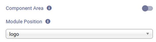
Repeat for the second blue row and rename its module position to be menu. Here is the result:
Click on the four squares to the right of the third row Section Title.
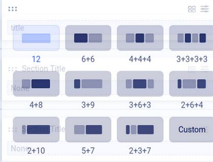
This popup allows us to divide the row into a combination of columns. Because we will use the first row for a full width header, leave it at the default value of 12. But give the fourth row three columns (4, 4. 4). Then click on the arrows to the right of the four boxes for the third Section Title Row.
We will call this Section Slideshow and check Yes for Fluid Width. Then click on the Style button and change the background color to light blue #000000. Then click Apply. Repeat for Top Row 2 with Light Green for the fourth row called Top Row 1. Then click on the three hidden dots to the right of the word None in Slideshow.
Click on Module Position, Select an Option. This will bring up a list with more than 36 module positions that looks like this:
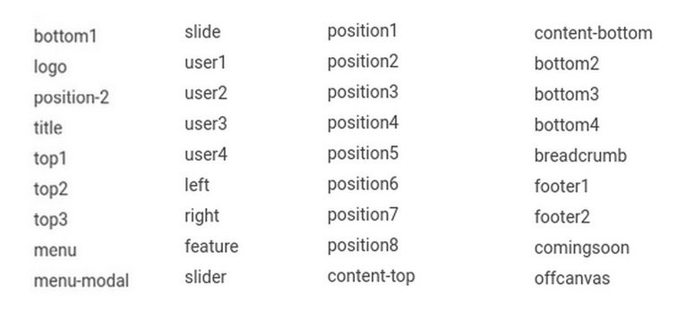
The module positions that have already been taken are logo, menu, left, right, bottom 1,2, 3, 4 and footer 1,2. This still leaves us with 27 module positions to display our content. We will call our third row slider as that is the module position we will assign to our slideshow. Then click Apply. Top Row 4 has 3 dots to the right of each word None. Call the first box top1, the second box, top2 and the third top3. Here is our new layout:
Change Row Background Colors
Adding different colors to different rows helps our website visitors better understand the layout of our website.
We would like the background of our header row to match the color of our header border which is #2222aa. Click on the Header row arrows to bring up the row edit screen. Then click on Style and change the Background Color to #2222AA. Then click Apply. Then click Save.
Next click on the Menu row edit button. Click Style and change the background color to light green #DDFFDD. Click Apply. Then click Save.
Next click the Slideshow row edit button. Click Style and change the background color to black #000000. Click Apply. Then click Save.
Next click the Top Row 1 edit button. Click Style and change the background color to #FFDDFF. Click Apply. Then click Save.
Then click the X to close the Layout popup. Then click X to close the Template Edit screen.
Make the Header Module Visible Again
When we switched from the Cassiopeia template to the Helix template, the header module was no longer visible. To make it visible again, click Content, Site Modules. Then click on the Header module to edit it. To see the module with the Cassiopeia template, we had placed the header module in the Banner module position. Change this to the Helix Logo Position. Then click Save and Close and View the Site:

Changing module positions solved the problem. Click on the featured Welcome article title to go from the Home page to the article page.

There are three social icons on the right between the article title and the article text. These are Facebook, Twitter and Linked In. Given that these mega monopolies engage in extreme censorship that violate our rights, we should not promote any of them. To hide these social icons, go to Templates, Styles and edit the Helix template. Click Blog. Then click Details. Then turn off Social Share.
Delete Social Icons from the Mobile Menu
Sadly, if you narrow the browser to the Tablet or Mobile width, the social icons come back with the Mobile Menu. To hide social icons on the mobile menu, click Templates, Styles and click on the Helix template to edit it. Click Menus. In the Menu screen, scroll down to Off Canvas Menu and turn off Social Links, Login and Contact. Then click Save and close the Template Edit screen.
Add a Second Browser to Clear the Browser Cache
We will make some changes in the CSS to get our web pages looking exactly the way we want.

When building a website, we first make changes in the back end (the Joomla Dashboard). We then view those changes in the front end (what our website visitors see). In order to view the changes on the front end, we not only need to click SAVE on the back end for the changes to be applied to our server, but we also need to clear the browser memory – also called the browser cache – on the front end and occasionally even on the back end. Unfortunately, if we use the same browser on both the front end and the back end, when we clear the cache on the front end, Joomla will log us out of the back end of our website. This requires us to log back into the back end to make more changes.
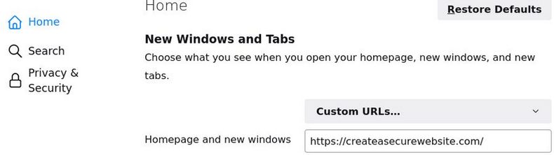
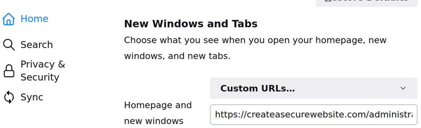
To avoid being logged out of the back end of our website, and still be able to clear the browser cache on the front end, you should add a second browser to view the front end of your website. This will allow you to clear the cache on the front end browser to see the changes while not clearing the browser on your back end browser to avoid being logged out of the back end. This is why I use the Firefox browser to make changes in the back end of my website – but I use the Libre Wolf browser to clear the cache and view the changes on the front end of my website. To make this process easier, I set the Home page for my Libre Wolf browser to be the front end of the Joomla website I am working on by going to Libre Wolf Preferences, clicking on Home, changing to Homepage to Custom URLS and copy pasting my website admin page URL .
I have also added a top menu to the Libre Wolf browser by clicking on Customize, then Toolbars and checking the Menu Bar. Here is the top of my Libre Wolf browser Start Page showing the top menu:
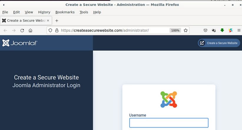
To clear the front end Libre Wolf browser cache, in the new top browser menu, click on History, Clear Recent History. Then set the Time Range to Everything. Then click OK. Then reload the page. Then see if the change you were trying to make actually occurred in the way you wanted. I also add the menu bar to the Firefox browser. But I only rarely use it to clear the cache. I then set the Joomla Administrator log in page for the website I am working on to be the start page for the Firefox browser:
Here is what the Firefox Start Page looks like:
This is my entire Desktop showing both browsers as an example of Side by Side editing:
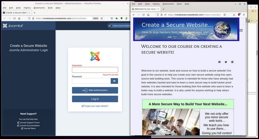
Note that each browser takes up less than half the desktop. On the far right side of the desktop is a Libre Writer document I use to take screen shots and record the changes I am making to the website and for copying CSS changes from the front end browser Inspector to the back end Template CSS box.
Use the Front End Browser Inspector
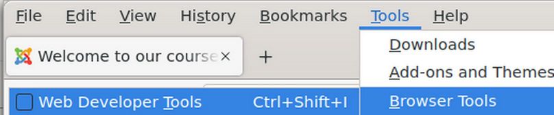
In the Libre Wolf Front End browser top menu, click Tools, Browser Tools, Web Developer Tools:
This will open a split screen with your website front end at the top of the browser and the HTML code in a lower left box and the CSS code in a lower right box. Below your website front end and above the HTML and CSS boxes is a menu with the Inspector icon on the far left side.
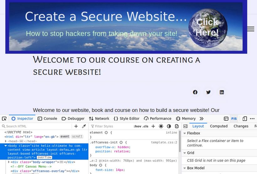
Click on the Inspector Icon which is to the left of the word Inspector.
Use CSS to fix the header ghost margin
Hover the inspector over the header row and click on it:
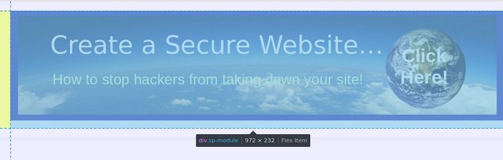
There is a small ghost margin on the left side of the screen that is preventing our header from taking up the entire space.
Add the following CSS to the Helix Custom CSS box:
#sp-header .sp-module {margin-left: 0px;}
Then click Save. Then click Close. Then clear the Joomla cache. Then clear the browser cache. This is why we have added this code to the bottom of the Helix Custom CSS box. Then click Save. Then in the front end browser, clear the cache and reload the page. Now the ghost margin is gone and our header is full width and centered.
Reduce the margin between the header and the article
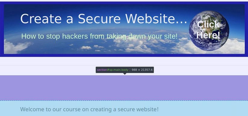
There is still a huge gap between the header and the article title:

In the front end browser, use the inspector to highlight this gap:
Click on this to show the CSS properties for sp-main-body:
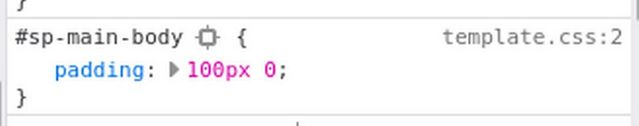
The main body padding vertical padding has been set for 100px. This is ridiculous. Add the following to the Helix Custom CSS box:
#sp-main-body {padding: 20px 0;}
Click Save. Then clear the cache on the front end browser, reload the page and view the result:

There is still some space between our header and the article title. But this will be taken up when we add a menu below our header.
Reduce the width of the article column:
On wider screens, the article column is too wide. Studies have shown that reading is faster and comprehension greater if the number of words per column is about 14. Below there are more than 20 words per column. This is despite the fact that we have set the body layout to be a Boxed Layout.

What causes this is that Bootstrap sets the columns too wide on wide screens - and Helix does not offer us an easy way to make the boxed layout narrower. We will therefore have to use CSS to fix this problem. Add this to our Custom CSS box:
.layout-boxed .body-innerwrapper {max-width: 960px;}
Then clear the front end cache, reload the page and view the result:

This is still too wide. We have chosen a body width of 960 because it is divisible by 2, 3 and 4. So we can have 2, 3 or 4 columns. We do not want to reduce the body width any narrower than 960 pixels because we will need this width to place our Feature Box modules later in this course.
Thankfully, there is a class called .articleBody that we can use to make the article column narrower while leaving the body at 960 pixels. Add this to our Custom CSS box.
.articleBody {max-width: 880px; padding-left: 20px;}
And add this to the main body element CSS:
#sp-main-body {padding: 20px 60px; max-width: 920px;}

There are a few more lines we need to add to our Helix Custom CSS. Here is the complete list of 8 CSS changes:
#sp-header .sp-module {margin-left: 0px;}
#sp-main-body {padding: 20px 60px; max-width: 920px;}
.layout-boxed .body-innerwrapper {max-width: 960px;}
.articleBody {max-width: 880px; padding-left: 20px;}
#sp-menu .sp-column {height: 30px;}
.sp-megamenu-parent > li > a, .sp-megamenu-parent > li > span {
line-height: 30px;}
.menu-with-offcanvas {display: none:}
.container-sm {padding-right: 0 !important; padding-left 0 !important;}
Move the Custom CSS Lines to a Custom CSS File
The Helix Custom CSS box is convenient. But right click on your Home page and click View Source. You will see that all of these CSS lines are added to the head of the HTML file. It is much better to add them to a template custom.css file. Note: While the default Joomla template insists on a file named user.css file, the Helix template insists on a file named custom.css. To create a custom.css file, go to Templates, Code and click on the Shaper_Helix template to edit it. Then click New File. For File Name, type custom. For File Type, select css. Click on the css folder in the left column to select it.

Then click Create. This will open up a custom.css file on Line 1. Copy paste the CSS from the Helix Custom Code box. Then Save and Close the file. Then delete the CSS from the Helix Code box and click Save. Then view the front end to verify the result is the same.
This completes our customization of the Helix template. If you would like to learn more about how to read and edit CSS, we have a complete course that will introduce you to both HTML and CSS. Here is the link: https://learnhtmlandcss.com/
What’s Next?
In the next article, we will review how to add and configure the Phoca Cart Shopping Cart.